Sheen & Shine

Heather Perkins • August 13, 2023

Choosing the right sheen for your cabinets

ICRO satin finish

From glossy to matte, choosing the right paint sheen or finish for your cabinets can be a big decision where there are several factors to consider. Before we get into the how-to', let's give you a bit of a background on what sheen is and how it's measured.


In a most recent edition of American Painting Contractor (APC) magazine, in an article entitled From Flat to Gloss, writer Jerry Rabushka interviewed Mike Mundwiller, Senior Manager of end-user product experience at Benjamin Moore.  Mike explains that  "sheen is a component of gloss, and gloss is an optical property that indicates how well a surface reflects light.  From a formulation perspective, gloss is determined by the pigment volume concentration.  PVC is a measure of how much volume there is in a paint compared to the volume of solid binder (vehicle).  The higher the pigment, the lower the sheen the paint will have." 


To complicate matters more, sheen levels can vary from manufacturer to manufacturer, so Benjamin Moore's satin sheen may be a lot shinier than ICRO's satin sheen.  For this reason, paint manufacturer's gauge sheen by numbers that measure the amount of gloss and sheen.  Gloss is measured at 60 degrees and sheen is measured at 85, which are both measurements read perpendicular to the substrate according to Mundwiller.  In the same article, Rabushka interviewed PPG's director of portfolio management, John Salvadore.  John gives insight into distinguishing the differences in sheen measurements. He states that "numbers are used to measure the reflectiveness of light on a painted surface and will differ across sheens for the same product. In PPG Prominence Interior Paint flat sheen is measured at 1-3 @ 60 & 85 degrees. The same product in satin sheen measures at 10-20 @ 60 degress or 20-35 @ 85 degrees." 


To simplify things,  the lower the gloss unit number (GU), the less shiny the sheen.  For example, ICRO's newest sheen on the market called Soft Matt has a very low 2 GU making it not shiny at all, while it's satin finish has a GU of 10 making is slightly shiny and ICRO's "gloss" finish has a GU of 30 which is what one would think of as a semi-gloss.  There are some manufacturer's with high gloss finishes in the 60's-80's giving a super shiny yacht-looking apprearance.


We know this is a lot of technical information, so what should you consider when picking out your cabinet finish

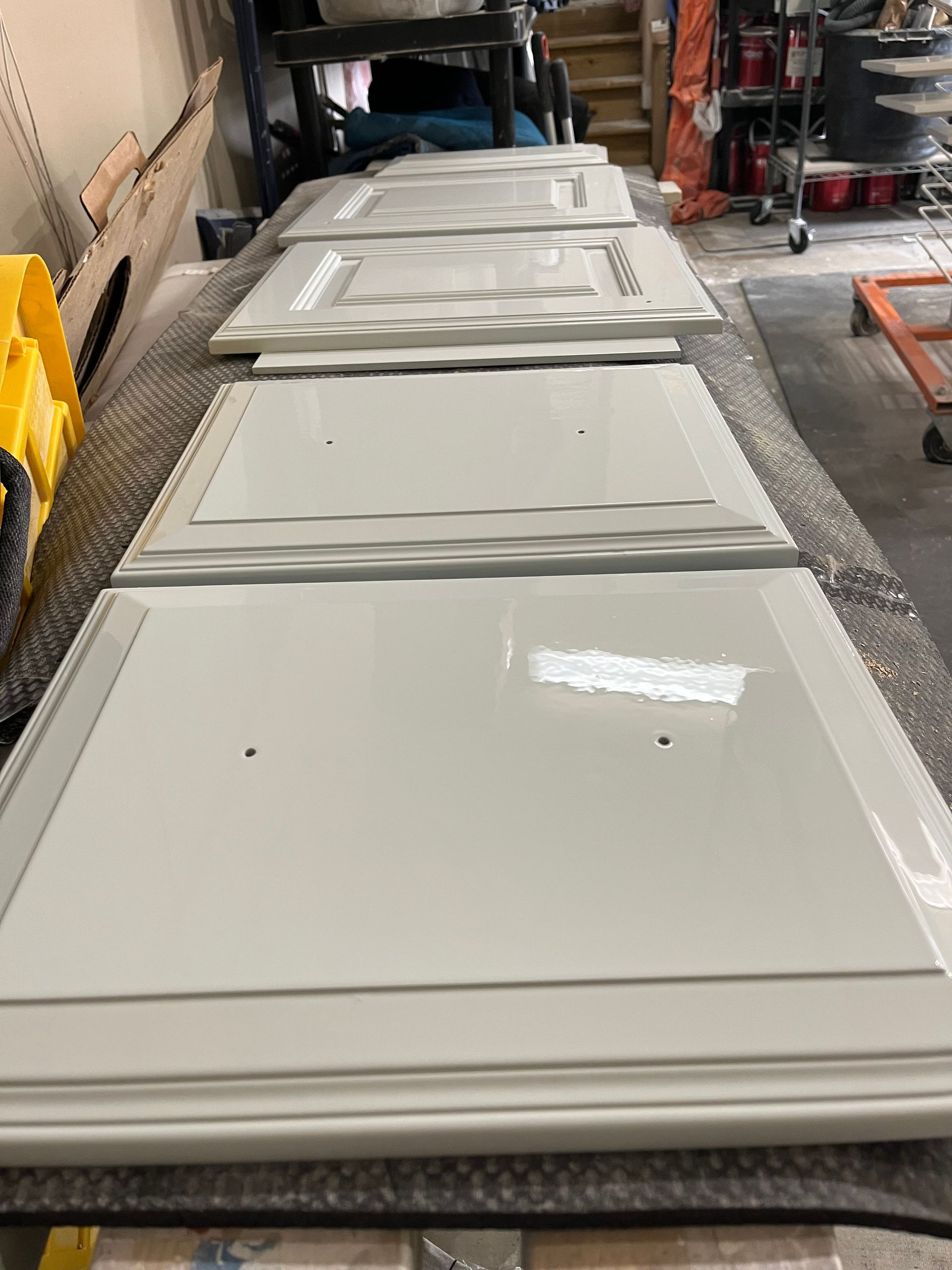
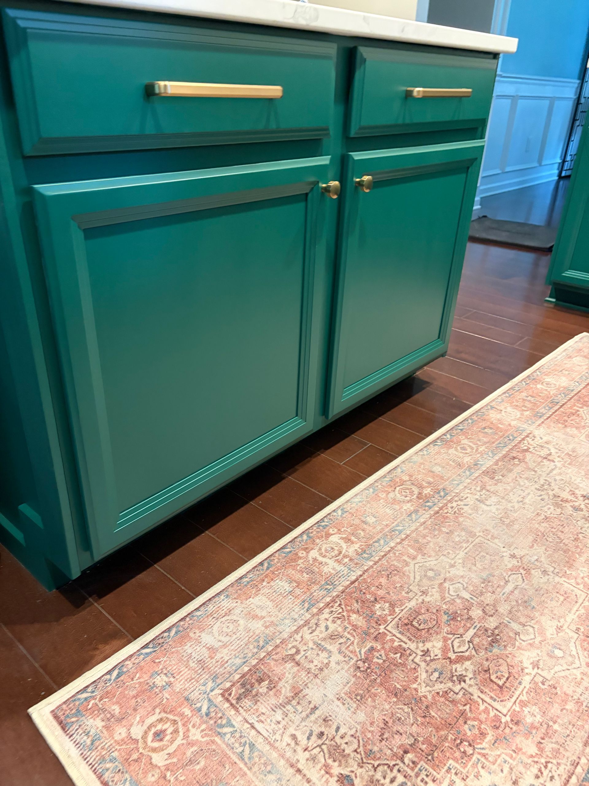
  • First, think about the overall style and aesthetic of your kitchen as well as latest cabinet trends. A high-gloss sheen adds a modern and sleek look, while a satin or semi-gloss finish provides a more traditional and timeless appeal.  In recent years, homeowners are opting for less shine and satin finishes are extremely popular with younger generations.
  • Next, consider the level of durability you need. High-gloss finishes can be more resistant to scratches and stains, making them ideal for busy households. On the other hand, satin or semi-gloss sheens are easier to maintain and touch up.
  • Cleanability is another factor to consider.  Typically, the glossier the finish, the easier it is to clean.  If your a household that uses a lot of spices when you cook that may stain your cabinets, considering a glossier finish may be a wise thought. 
  • Lastly consider the lighting in your kitchen. Higher sheen levels reflect more light, creating a brighter and more spacious feel.  If you have a smaller kitchen with darker lighting a higher sheen may work well.


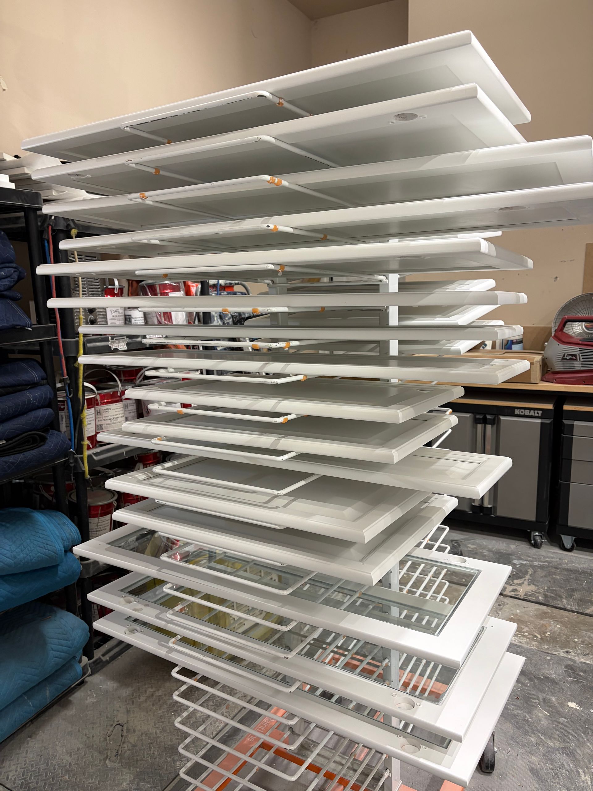
At A La Carte Cabinet Painting, we offer expert advice and a variety of sheen options in our Italian wood coatings to help you achieve the perfect look for your cabinets.

Share Post

By Heather Perkins June 28, 2025
Adding color to your cabinets is a big decision and one that defines the look of your space. While choosing a trending color can be tempting, it often creates a look that feels temporarily "updated" rather than timeless. Making a long-lasting, thoughtful color cam feel daunting, but it doesn't have to be. In this guide, we'll explore some upcoming design trends and color suggestions that may align perfectly with your future cabinet painting project! Color Trend Forecast: A Return to Warmth Color trend prediction isn't a hard science-it's an evolving blend of industry insight, expert intuition and countless hours of cultural and market research. Trends are cyclical; what's old often becomes new again. In recent years, we've seen the rise of bright whites and cool tones dominating design, especially in kitchens---think clean lines, circular silhouettes, Taj Mahal quartzite countertops, and Chantilly Lace bright white cabinetry. However, a subtle but steady shift is underway. Consumers are beginning to move away from stark, high-contrast whites and cool minimalism. In their place, we're seeing a growing embrace of warmer, softer off-white and greige tones that evoke comfort and character without sacrificing brightness. Looking ahead to this year and beyond, the future of interior design is leaning toward warmth, personality, and a sense of intimacy. Spaces are becoming more inviting, personal, and emotionally resonant-less showroom-perfect and more lived-in and loved. Below is a list of some of our all time favorite colors that exude warmth characterized by color family: Blacks & Browns #1. Sherwin Williams Urbane Bronze : a rich dark grounding greige with green leaning #2. Sherwin Williams Black Fox : a beguiling black neutral with a warm greige undertone #3. Benjamin Moore Dragon's Breath : a deep dark gray-brown with a touch of green #4. Benjamin Moore Wrought Iron : a popular accent color with slight purple undertone #5. S herwin Williams Black Magic : warm, timeless and sophisticated black Off Whites #1. Benjamin Moore Swiss Coffee : with a light reflectance value of 83, this beige leaning off white goes perfect with warm granites #2. Benjamin Moore Seapearl: slightly darker than it's brother color Swiss Coffee, this versatile off white can lean a little cool too #3. Benjamin Moore Ballet White : more warm depth but not a yellow white. #4. Sherwin Williams Alabaster: a popular choice for soft white cabinets keeping your look bright but inviting #5. Benjamin Moore White Dove : a top contender for its neutrality this color is similar to Swiss Coffee but less beige. Light Greiges #1. Benjamin Moore Edgecomb Gray : timeless, earthy organic taupe greige with hints of beige and green #2. Benjamin Moore Revere Pewter: an iconi. c neutral color that adapts beautifully to its environment #3. Benjamin Moore Classic Gray : ultra light greige that behaves more like an off white #4. Magnolia Homes Gatherings: this is a golden gray with amber, beige and a wink of green undertones #5. Benjamin Moore Pale Oak: a light neutral taupe greige with subtle purple-pink undertones When considering your palette, warm greens with earthy leanings are especially grounding and soothing like Benjamin Moore's Dark Olive or Sherwin Williams Night Owl . For a more dramatic and saturated statement consider incorporating a deep sophisticated burgandy like Farrow and Ball's Brinjal . This evokes depth and warmth and pairs symbiotically with accents of burnished gold, warm natural woods and fabrics with hints of red or gray undertones. To add a touch of classic coolness, a refined blue like Benjamin Moore's Britannia Blue can be striking. It balances wonderfully when anchored with warm neutrals like Revere Pewter, offering a harmonious blend of warmth and contrast across the space. At A La Carte Cabinet Painting, we offer complementary expert color guidance for our clients, helping them choose the perfect hue for your space---creating a timeless and personalized look that reflects their unique style. Need help picking the perfect cabinet color? Book a free estimate and schedule a color consultation today! As the owner of A La Carte Cabinet Painting , Heather Perkins, has a Bachelor of Arts and a strong foundation in color theory staying attuned to evolving design trends to assist clients in creating spaces that are both timeless and on-trend.
By Heather Perkins June 24, 2025
Painting your cabinets can completely transform your kitchen or bathroom, but to get durable long-lasting professional results, it's critical to understand a little bit about the difference in cabinet coatings. Here's a breakdown of what you need to know before you paint in the order of durability: Types of Cabinet Coatings Acrylic Paint (water-based) -Examples: Sherwin Williams Emerald Urethane, Behr Cabinet & Trim Enamel Pros: Easy-to-use, fast drying, can readily purchase at retail store, less expensive, DIY non-professional use Cons: Less durable than oil-based, 2 component (2k), solvent based products. Hand oils break down coating over time. Alkyd Paint (synthetic oil-based or water-based) -Examples: Behr premium urethane alkyd enamel, Benjamin Moore Advance Pros: hard, durable finish suitable for high traffic areas, relatively fast dry time, UV resistant Cons: longer cure time, longer-lasting smell, hand oils can break down finish. Lacquers -Examples: Sherwin Williams Sher-Wood Kem Aqua, General Finishes Enduro, Lenmar, Pros: quick drying, used in professional applications, smooth finish, high gloss capability, moisture/chemical resistant if catalyzed. Cons: if not catalyzed, can become brittle and yellow over time. Polyurethanes (solvent or water-based) -Examples: ICRO, Renner, Milesi, Ilva, Sherwin Williams Gallery Series, Centurion Pros: quick-drying, extremely durable, can be catalyzed for more durability, UV/chemical resistant, low VOC, manufacturer-like finish, high-traffic use. Designed to be sprayed, but can also be rolled with correct technique. Cons: more expensive, must be professionally applied. Conversion Varnish -High-end, factory-applied finish, professional application only Pros: long-lasting, most durable finish available Cons: Factory shot, most refinishing shops don't shoot this type of finish. At A La Carte Cabinet Painting we understand that choosing the right product for finishing cabinets involves balancing functionality, aesthetic preferences, skill level and overall budget. That's why we've chosen to specialize in eco-conscious, Italian-made water-based polyurethane wood coatings-a premium solution that delivers both beauty and durability. We proudly offer: Eco-friendly Italian Polyurethane Finishes: designed for long-lasting performance, these coatings are not only environmentally responsible but also guaranteed not to yellow, chip, or peel when properly applied. Professional Spray Application : Doors and drawers are professionally sprayed for a smooth, factory-quality look. You also have the option to choose between spray or rolled cabinet boxes, depending on your needs and budget. Partnership with Hartley Group Distributors: as one of the first adopters of these premium European products in the U.S., we've partnered with The Hartley Group of Cornelius, NC to bring this innovative coatings system to the Raleigh, NC market. Whether you're upgrading your kitchen, bathroom, or built-ins, our high-performance water-based finishes are a smart, stylish and sustainable choice!
By Heather Perkins February 11, 2025
The year 2025 welcomes a collection of warm, neutral, and natural hues. In this blog, we delve into several key signature elements anticipated in today's designs. Design and Layout: Expect minimalistic, clean, and uncluttered spaces featuring concealed pantries, preparation areas, and sculleries that effectively hide messes, enhancing the experience of entertaining. Incorporating drawers throughout lower cabinetry provides additional storage, improved organization, and a practical solution for accommodating heavy pots and pans. Expansive islands equipped with built-in appliances and seating merge form and function, creating a shared space for both gathering and cooking seamlessly. Full overlay European-style cabinetry takes the center stage with it's sleek, modern appeal while traditional partial overlay takes a backseat in 2025. Open Shelving to neatly display plates, glasses, or cool trinkets and artwork add structural visual interest to and open up otherwise crowded wall space. Under Cabinet Lighting highlights countertop and backsplash and brightens the space Color Trends: Warm tones are in vogue while cool hues have taken a back seat. The era of stark white, sterile kitchens is a thing of the past; inviting warm shades encourage friends and family to congregate in a more welcoming atmosphere. Additionally, combinations of diverse textures and colors are trending. Rich, stained wood paired with gentle off-whites, greiges (a blend of grey and beige), or striking deep colors are all the rage this year. Below are some of our top color selections: Off Whites: Benjamin Moore Swiss Coffee (Light Reflectance Value 83), Benjamin Moore White Dove (LRV 83), Benjamin Moore Seapearl (LRV 78) and Benjamin Moore Ballet White (LRV 72) Greiges: Benjamin Moore Classic Gray (LRV 73), Benjamin Moore Revere Pewter (LRV 55), Sherwin Williams Accessible Beige (LRV 58), Benjamin Moore Edgecomb Gray (LRV 63) and Benjamin Moore Pale Oak (68) Moody Darks: Sherwin Williams Rosemary, Sherwin Williams Urbane Bronze, Sherwin Williams Naval, Benjamin Moore Kendall Charcoal and Sherwin Williams Black Magic Two-toned Kitchens: Natural woods mixed with painted cabinetry Finishes: Uniform finishes across the board are a thing of the past. Incorporating a blend of sheens and metals to create a subtle yet complementary contrast with cabinet colors introduces both interest and sophistication to the area. Warm metals such as antique brass can be beautifully combined with classic bronze or satin nickel, while polished brass provides a striking complement to polished chrome. Design professionals advise a maximum combination of 2-3 metals to achieve both interest and harmony within the space. At A La Carte Cabinet Painting, we provide complimentary expert color consultations designed to assist our clients in selecting shades that perfectly reflect their personality and design aspirations. We also order up to three Samplize color swatches for our clients, allowing them to visualize their preferred color options within their own space. These oversized peel and stick swatches are crafted from genuine paint by Sherwin Williams, Benjamin Moore, PPG, and Farrow and Ball.
More Posts